

Your PERGRAPHICA® Sample Folder
Pergraphica is a full spectrum premium design paper that was made to serve as the perfect, tactile backdrop to your design work and creative communication. Whatever feeling you want to evoke, we have the right shade for you. To unleash your full creativity, Pergraphica is optimised for multiple printing, converting and post-print processing techniques.
In the sample folder you will find a selection of A4 sample sheets of different grades and grammages to give you an impression of the unique look & feel of Pergraphica.
Please note:
- Please fill in all the fields below (including telephone number) so we can get back to you in case of questions.
- The sample folders can only be delivered within the EU and to the following countries: Albania, Andorra, Bosnia and Herzegovina, Kosovo, Liechtenstein, Monaco, Montenegro, North Macedonia, Norway, San Marino, Switzerland, Serbia, United Kingdom, Vatican City.
- You can only place one order per quarter.
First, we took a long and hard look at how much we wanted to show of each shade and grammage. We had listened to the feedback we had received to our previous feelbook and decided, in order to do justice to both look and feel, to forego the common waterfall format and go full-sheet for every shade and grammage.
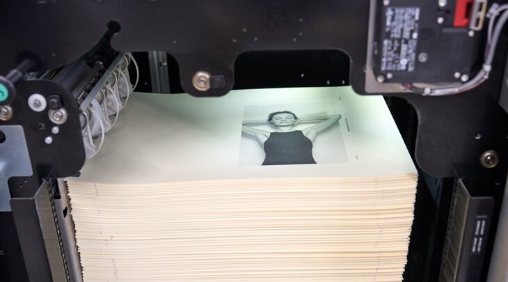
Now, we also wanted to allow for as many comparisons as possible, not just between papers, but between printing technologies as well. Therefore, our Pergraphica Colours Feelbook was printed using three different printing technologies: conventional offset, Xerox Iridesse and Indigo 7600. Sure, we were aware that this would add considerable complexity to the production process, but with world-class UK design-agency BOB and Swiss printers Bubu and groupe Gassmann at our disposal, we had all the support we needed.
Before anyone would even get a look inside the book, though, we wanted to dazzle them with a cover that plays on one of the core-strengths of Pergraphica: its haptics.
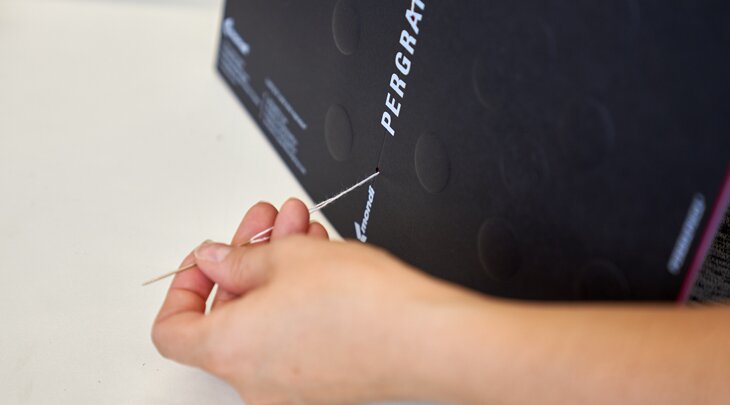
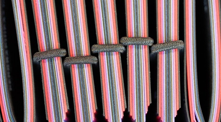
We pulled this off with blind embossing on 300g/m2 Pergraphica Classic Rough, and the LE-UV printed logo showing off how crisp and clean this finishing technology works on Pergraphica. And thanks to the knot-threadbinding, both used for our Pergraphica Whites and Pergraphica Colours Feelbooks, all the shades and colours could now be seen at first glance as well. An industry first, we should add.
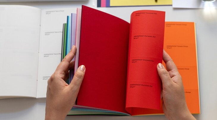
Inside, after an introduction to Pergraphica in English, German, French and Italian, we gave every Pergraphica Whites shade a full, separate page for every available grammage. With 31 new Pergraphica Colours, we didn’t want to create a tome, so we limited ourselves to one grammage per colour. To top it off, every page now displays available grammages, formats, grain directions and certificates. And for anyone who wants even more information at a glance, at the end of both feelbooks we added a portfolio overview, complete with the available grammages and formats.
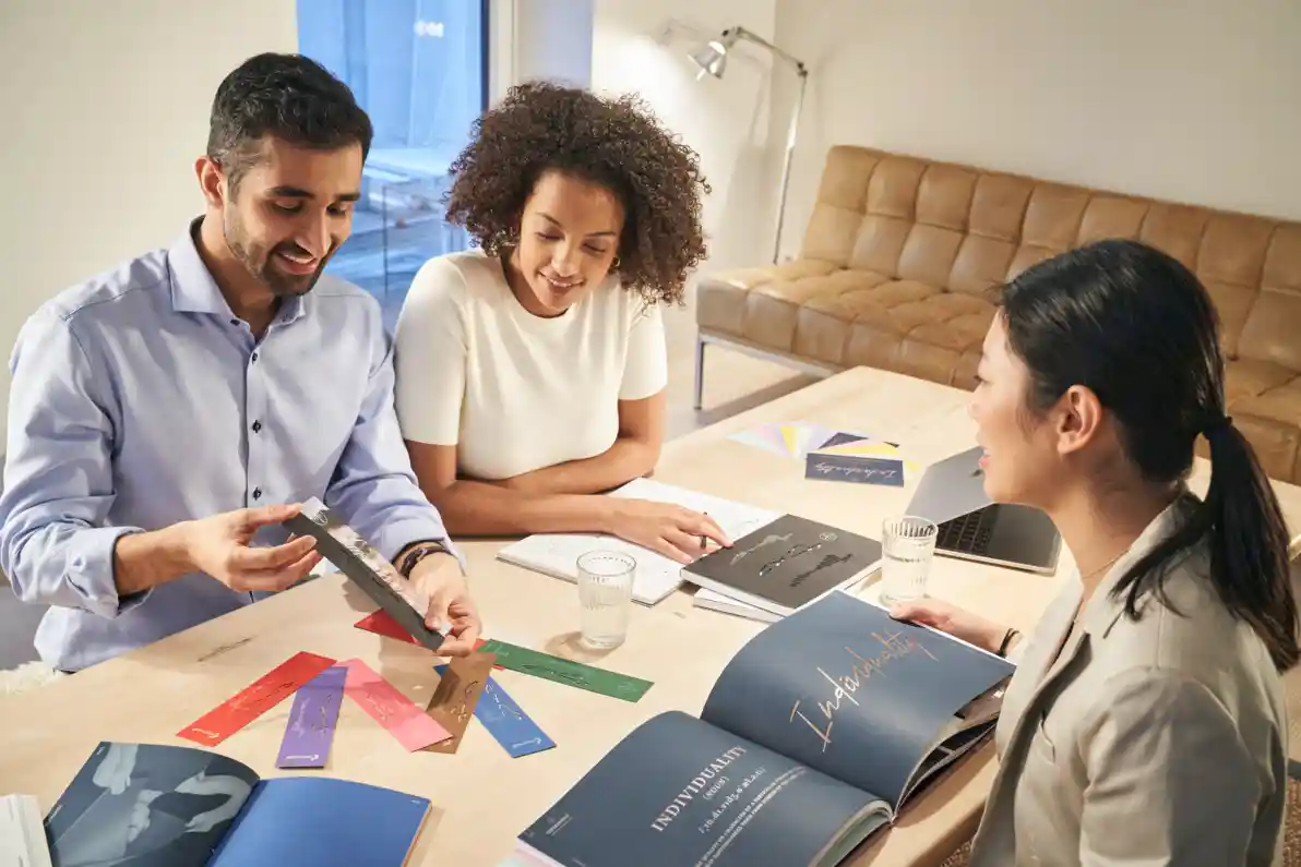
So, having covered what we deem the essentials, we decided to go a step further and make our feelbooks not merely informative but fun to flip through as well: custom photography, created at a photoshoot in London, was added to each shade and colour, bringing to life what would otherwise be a rather static page.
Seeing is believing, and what’s more believable than our paper in action?
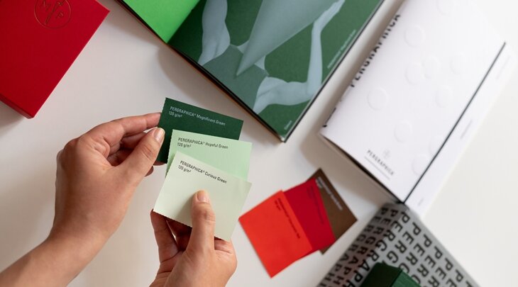
Finally, we added a feature we identified as one of the most desired during the many feedback rounds with some of our biggest distributors: the option to compare colours side by side or even create your own groups of colours. You’ll now find, at the end of each feelbook, little tear-out cards, comprising the whole portfolio, which you can easily remove due to the added micro-perforations.
In summary, we made a good thing even better – and then added even more good stuff on top. If you want to go from reading about our feelbooks to holding them in your hands, don’t hesitate to contact our team, so they can help you explore them with you.
Share with your network


How can we help?
Whether you have a question about our papers, want to request a sample or need some guidance, our team is looking forward to consulting you on your next paper & print project.
Get in touch with us via our contact form or give us a call at +43 1 79013-4990.
Want to know what we are up to and the latest news on the paper industry? Subscribe to our newsletter now!