

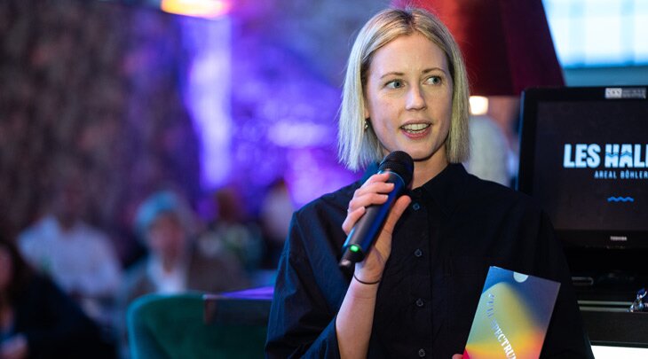
Bringing Full Spectrum Feels to life: An interview with designer Laura Jane Boast
Designing for print brings a unique set of creative opportunities — especially when translating bold ideas from screen to paper. Laura Jane Boast, the designer behind Full Spectrum Feels, set out to showcase what is possible with PERGRAPHICA® papers — using paper shade, colour, texture, and finish to create a truly sensory print experience. In this interview, she shares the thinking behind Spectrum of Impressions: The Print Book, the campaign’s central piece, and her approach to creating emotionally engaging print design.
Let’s start with the concept — how did Full Spectrum Feels come to life?
The concept is rooted in one simple belief: that print should be felt, not just seen. Inspired by the emotional names of PERGRAPHICA® papers, I saw each shade as part of a wider emotional colour wheel — and knowing that feelings are rarely isolated, the idea of a full spectrum emerged naturally. Just as emotions span a range, so does the expressive potential of paper. With Full Spectrum Feels, I wanted to bring that to life in a way that’s tactile, immersive, and engaging.
What was the idea behind Full Spectrum Feels: The Print Book?
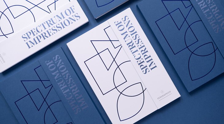
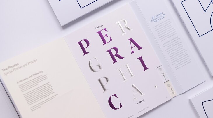
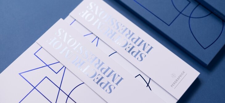
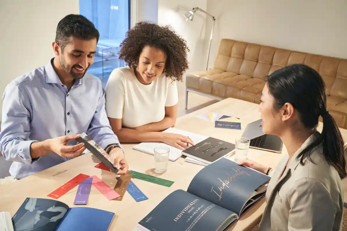
The idea started from a desire to show what’s truly possible when designing for print — especially with premium papers like PERGRAPHICA®. We didn’t want to create just another sample book; we set out to design an educational tool for designers, brand owners, and printers alike. The goal was to take them on a sensory journey that captures the emotional impact of print while showcasing the creative and technical range of PERGRAPHICA®. Spectrum of Impressions: The Print Book brings together multiple printing techniques, special finishes, die cuts, layering, and invites hands-on experience — showing how print, when designed with intention, can truly move people.
How did you approach the design to make the book feel interactive and immersive?
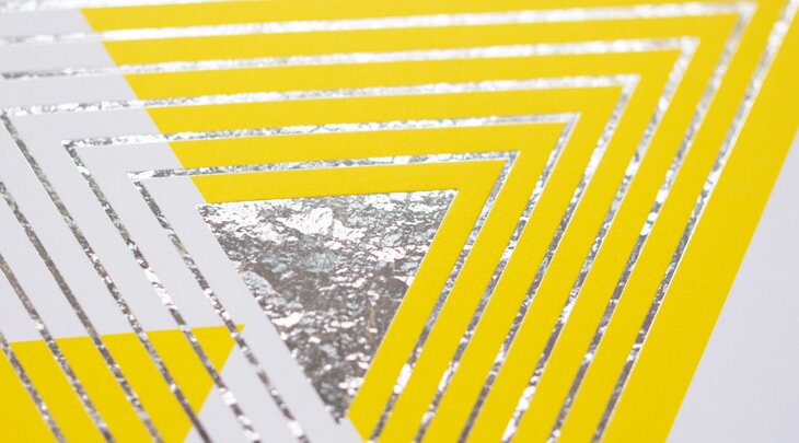
I approached the design with the mindset that every page should invite touch and spark curiosity. Rather than simply displaying print techniques, I wanted each element — from intricate embossing and varnishes to laser engraving and unexpected paper combinations — to encourage tactile interaction. Not just to impress, but to demonstrate what’s possible across every weight. These finishes give the book a richness that can’t be replicated on screen.
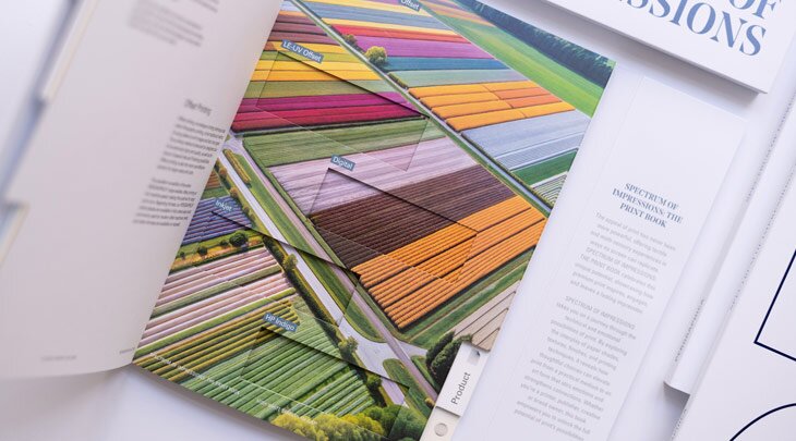
We also introduced die cuts as literal windows into comparison — repeating the same image on different shades of white — High White, Classic, and Natural — to let readers view them side by side and see how subtly paper shade changes perception. It’s an experience designed to slow the reader down, draw them into the details, and reveal the emotional and sensory power of print.
What was most important to convey with this design?
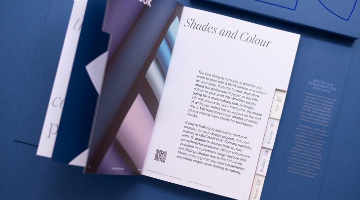
It was important that the design felt as educational as it was inspirational — a tool as much as a showcase. Everything you need to create a print project was brought together in one compact book. We structured it to move through different themes — the look, the feel, the process, the product, and the values — reflecting the journey of a real-life project.
Every decision, from paper colour, weight and surface texture, to format, binding, and print process, was made to show that paper is never just a background, but a creative tool in its own right. Real-life examples helped ground the inspiration in practical application. Above all, it needed to feel premium and intentional in every detail, while still encouraging freedom, play, and experimentation.
What role does designing specifically for paper play in this project?
Designing for paper means designing with paper. In this project, the material itself became a key part of the storytelling. Every choice — from weight and texture to colour — was carefully considered, shaping the design to complement the unique qualities of uncoated paper: its natural feel, softness, and its ability to bring depth and authenticity to every detail. I see it as a collaboration between myself as a designer and the medium I am working with. PERGRAPHICA® has such a rich tactile quality that I wanted to highlight, not hide. In a digital world, paper offers a chance to pause and connect. That’s what we hoped this book would achieve: to remind people that great design doesn’t just look good — it leaves a lasting impression.
Laura Jane Boast’s design work for PERGRAPHICA®’s Full Spectrum Feels campaign highlights not only her mastery of paper as a medium, but also her genuine passion for the tactile, interactive nature of print. Through her thoughtful approach, she reminds us that design isn’t just visual — it’s something we can feel. Her work energises and invites us to reimagine the creative potential of print, inspiring others to push boundaries across both physical and digital spaces.
Full Spectrum Feels
Full Spectrum Feels is a celebration of how creative design and emotion come to life on premium uncoated paper. Designed by paper lovers for paper lovers, this campaign highlights how print captivates, inspires, and leaves a lasting impression.
What is the Colour Wheel of Emotion?
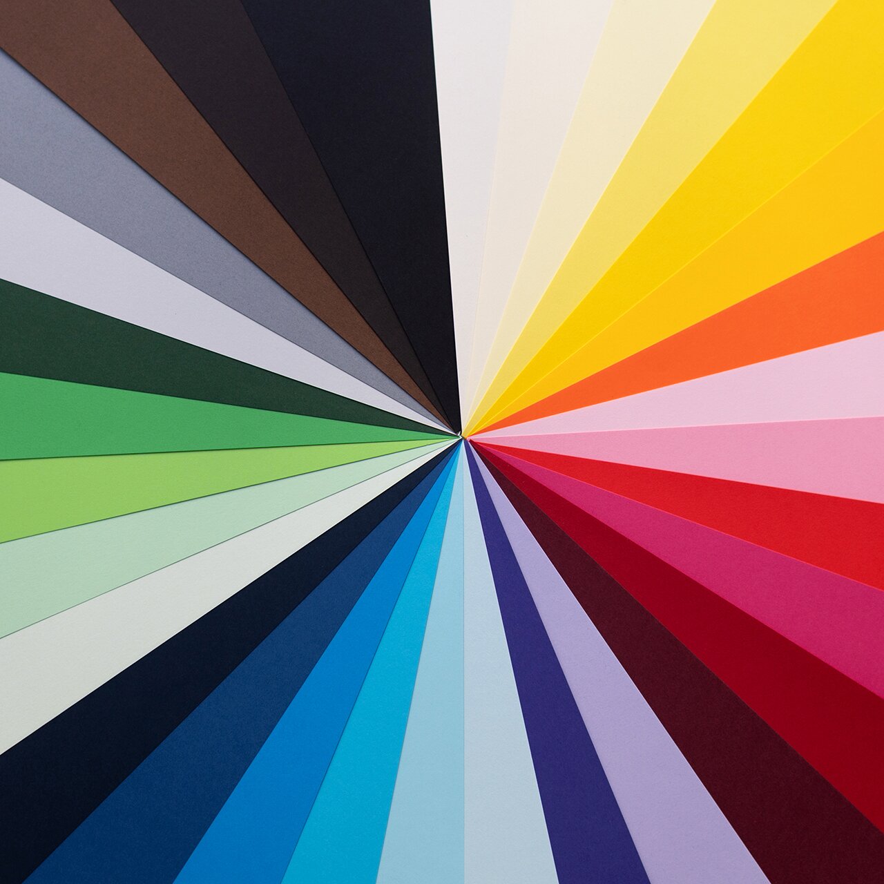
“When I first worked with PERGRAPHICA® Colours, what struck me was how complete the range felt — 31 shades forming a natural full spectrum. From that observation, I designed the Colour Wheel — an intuitive tool to help other creatives move effortlessly between tone, depth, brightness, and hue, and choose colour not just by how it looks, but by how it feels. It takes you from light to bright to deep — showing the full spectrum in a simplified, visual way that never feels overwhelming. You’re not just choosing a shade; you’re learning about the emotion behind it. ”
Share with your network


How can we help?
Whether you have a question about our papers, want to request a sample or need some guidance, our team is looking forward to consulting you on your next paper & print project.
Get in touch with us via our contact form or give us a call at +43 1 79013-4990.
Want to know what we are up to and the latest news on the paper industry? Subscribe to our newsletter now!