Story
Color and Type
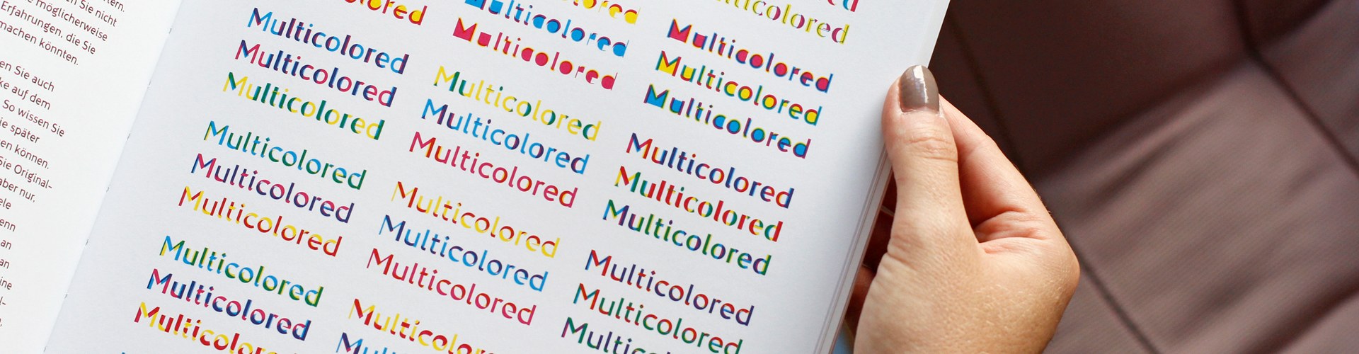
„Color is the new bold!“ writes Mark van Wageningen at the beginning of his book „Color and Type“, and judging by the contents, that’s not an empty promise.
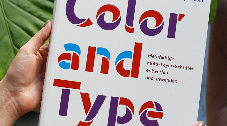
The premise of the book? The times of using only monochromatic fonts are over, what we can and should do now: publish more with polychromatic fonts.
Van Wageningen, renowned typography designer based in Amsterdam, makes not merely a good case for the usage of these types of colourful fonts, but also explains in detail the secrets of how to create the ideal polychromic font.
Van Wageningen, renowned typography designer based in Amsterdam, makes not merely a good case for the usage of these types of colourful fonts, but also explains in detail the secrets of how to create the ideal polychromic font.
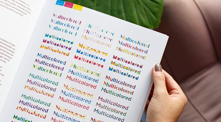
Filled with great examples in a multitude of coloured fonts, van Wageningen drives home the point that polychromatic fonts are not just a fad, but can be the one thing that sets your design apart from all the others.
To maximise the effects of multi-coloured fonts, the book is printed on High-White Smooth, Pergraphica’s whitest shade.
To maximise the effects of multi-coloured fonts, the book is printed on High-White Smooth, Pergraphica’s whitest shade.
Project:
Color and Type
Editor:
Mark van Wageningen
Print run:
3.262
Number of pages:
180